Wish You Were Here
Curating my Wish You Were Here Print Collection has been such a fun experience for me. Most importantly, it brought me back outside – visiting new places and photographing scenes for fun. And, it has also re-ignited my desire to create (which is an unexpected happy by-product of this journey).
During one of those little creative bursts, I thought it would be fun to create color palettes that pull tones from some of the beautiful scenery I’ve come across so far.
Below, you’ll find 7 travel-inspired color palettes utilizing all kinds of fun bold colors for you to incorporate in your own designs.
Cheers!
SUMMER SANDS + COOL BLUES
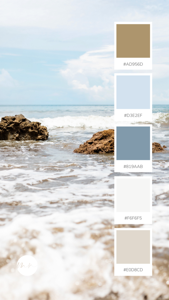
This cool coastal palette is inspired by the Playa Hermosa, Costa Rica I Print. With refreshing, clean tones, this palette would be perfect for a welcoming entryway or a relaxing bedroom retreat.
Shop the print here: https://monikanormandphoto.com/products/playa-hermosa-costa-rica-i/
Kickin’ it old school: Orange and Green Color Palette
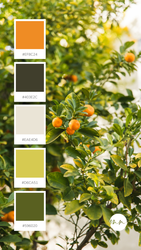
We’re bringing back the 70’s with this orange and clean greens color palette. This palette was inspired by the Kumquat Tree, Palm Springs Print, and we’re obsessed. This palette is for those who aren’t too shy to make a statement and commit to color. It would be a great fit for a bold living room or even a cheerful outdoor patio.
Shop the print here: https://monikanormandphoto.com/products/
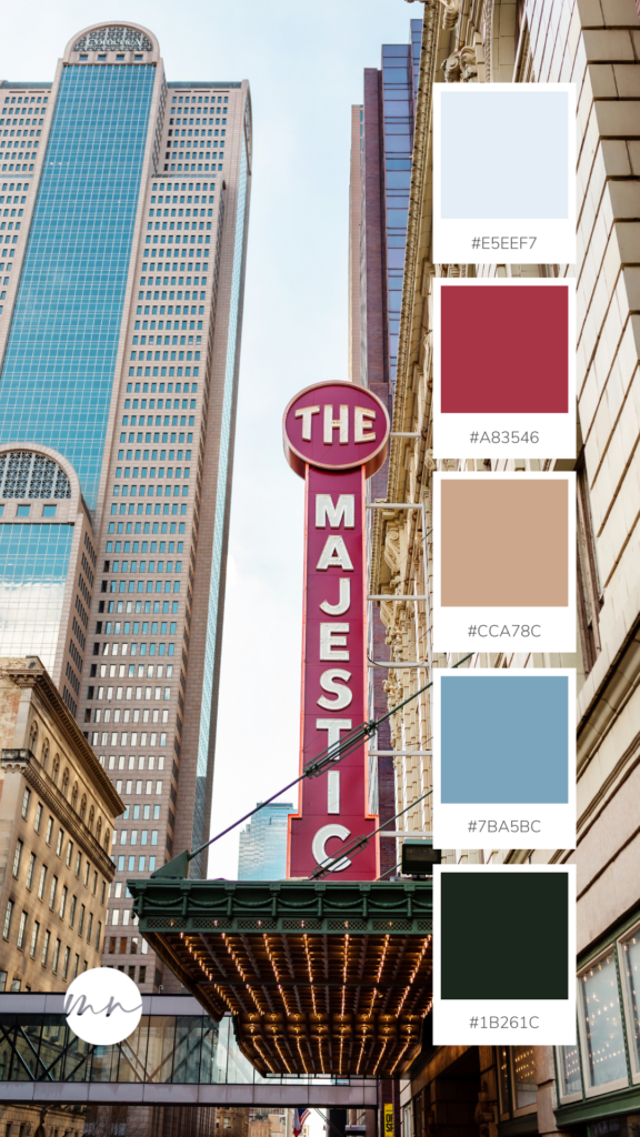
THE ALL AMERICAN: RED AND BLUE COLOR PALETTE
We’re bringing you vibrant colors again with this one, but keeping the palette traditional! Inspired by the Downtown Dallas I Print, this palette is as timeless as a good cityscape photo. Perfect for a boy’s bedroom, or to make a statement in a traditional living room space.
Shop the print here: https://monikanormandphoto.com/products/downtown-dallas-i/
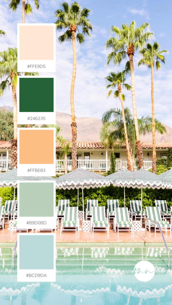
THE STAYCATION: BEACHY PEACH COLOR PALETTE
This palette is a fun one – warm peachy tan tones paired with soft greens and blues. Inspired by the Colony Palms I Print, this palette brings you poolside soothing tones perfect for your own home’s outdoor oasis or master bath.
Shop the print here: https://monikanormandphoto.com/products/the-colony-palms-i/
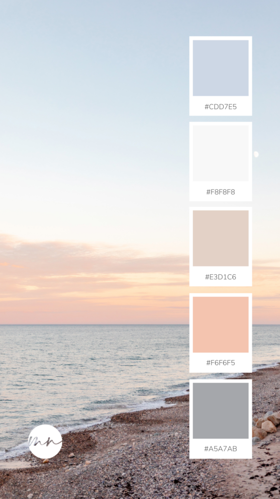
WARM SUMMER SUNSET: COASTAL COLOR PALETTE
Water/ocean inspired color palettes don’t always have to have cool tones – they can be warm and inviting too! This palette was inspired by the Humarock Beach, Massachusetts II Print, and it is both feminine and inviting. This palette is perfect for the beach house living room, creating a bedroom that feels like a vacation, or breathing life back into your master bath.
Shop the print here: https://monikanormandphoto.com/products/humarock-beach-massachusetts-ii/
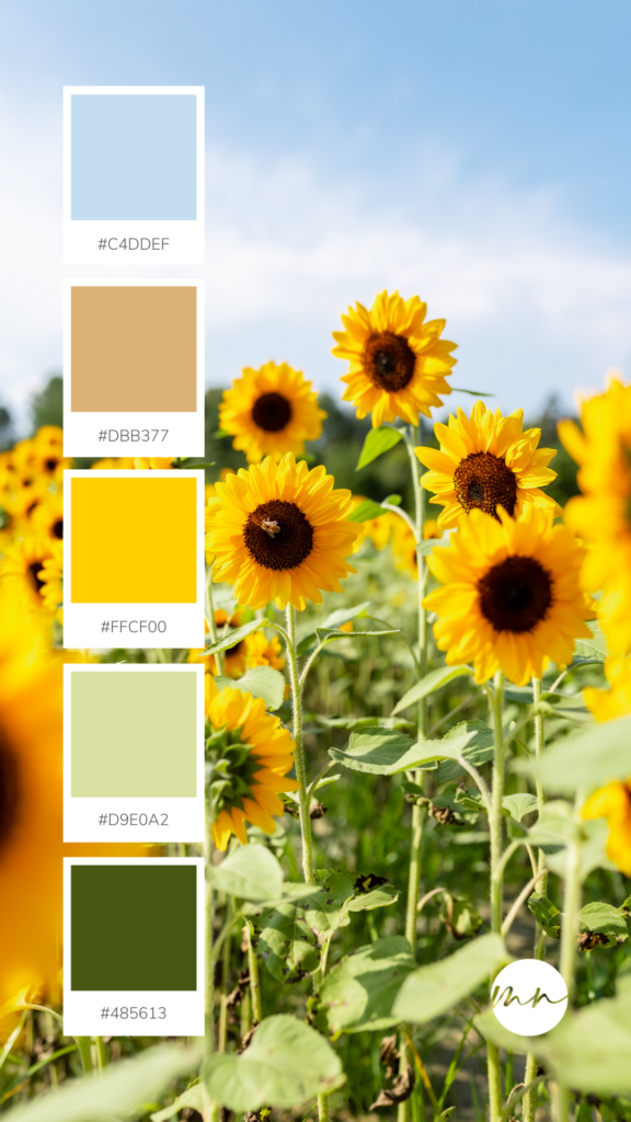
SUNFLOWER YELLOW COLOR PALETTE
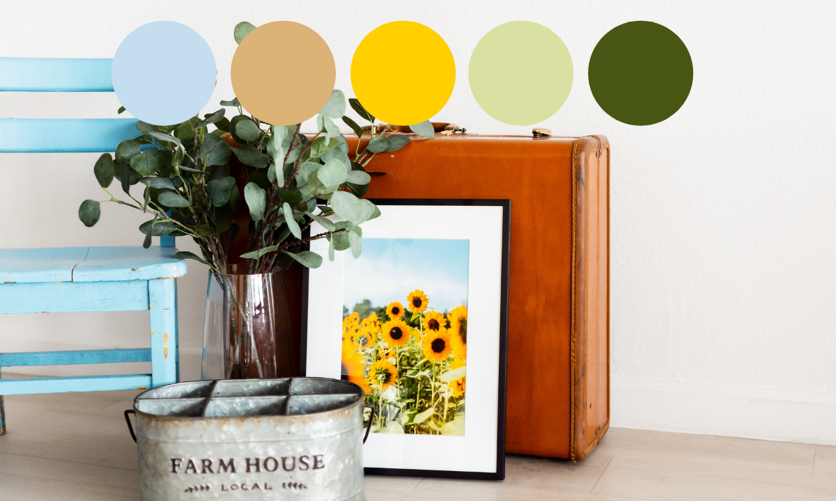
There’s no flower friendlier or brighter than a sunflower, and this palette is sure to brighten up your space. Inspired by the Sunflower Fields II Print, this palette incorporates a cool light blue, paired with inviting yellows and greens. This palette is a great out-of-your-comfort zone palette for those who typically prefer earthy, natural tones. This palette would be great again for outdoor living spaces as well as kitchen and dining areas.
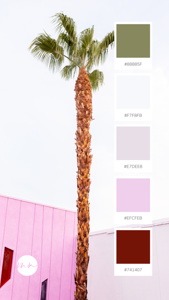
Olive meet Grape: A Palm Springs Inspired Color Palette
This color palette is the last we’ll be sharing today but it’s easily the most interesting and unusual one. It’s often tough to pair green and purple in an adult, sophisticated way, but I think this palette does just that. Inspired by the Saguaro Palm Springs II Print, this palette is perfect for a sophisticated personality-packed master bedroom or a home office you actually want to work in.
Shop the print here: https://monikanormandphoto.com/products/saguaro-palm-springs-ii/
Shop the full Wish You Were Here Print Collection: https://monikanormandphoto.com/collections/print-collection/
