

6 Branding Color Palettes to Inspire Your Design
On the topic of color…
Being a branding photographer has opened my world up when it comes all the aspects that go into building a brand. Voice, colors, font pairings – all these things are chosen intentionally and work together to make a cohesive brand. For me, color is one of the most important parts to focus on as a photographer. Brand colors represent so many things, and I want to be sure that the colors included in a branding photoshoot compliment my client’s brand and don’t distract from what they are trying to convey.
Building Palettes
I’m a big fan of exploring color palettes on Pinterest, and I have spent A LOT of time scrolling through pins in search of color palettes for my home, for weddings, and for my own brand and my clients’ brands as well. Although Pinterest will always be a valuable inspiration-resource for me, I realized that I’ve also been “collecting” so many fun color palettes organically on my own, with the variety of colors and tones I come across during branding photography sessions.
I thought it would be fun to start sharing the catalogue of color palettes I’ve been collecting, so here are 6 of my favorite branding color palettes that I’ve pulled from recent shoots. You can find color palettes anywhere if you’re paying attention, and you’ll see that this gallery proves just that. I hope these palettes give you some inspiration for decorating your home, building your brand, or designing your wedding.
As you scroll through this gallery, try to notice what colors stand out to you, what emotions they bring to you, and how the overall palette makes you feel. Identifying these feelings will help you pinpoint the colors that you may want to utilize when assembling a palette of your own. Enjoy!
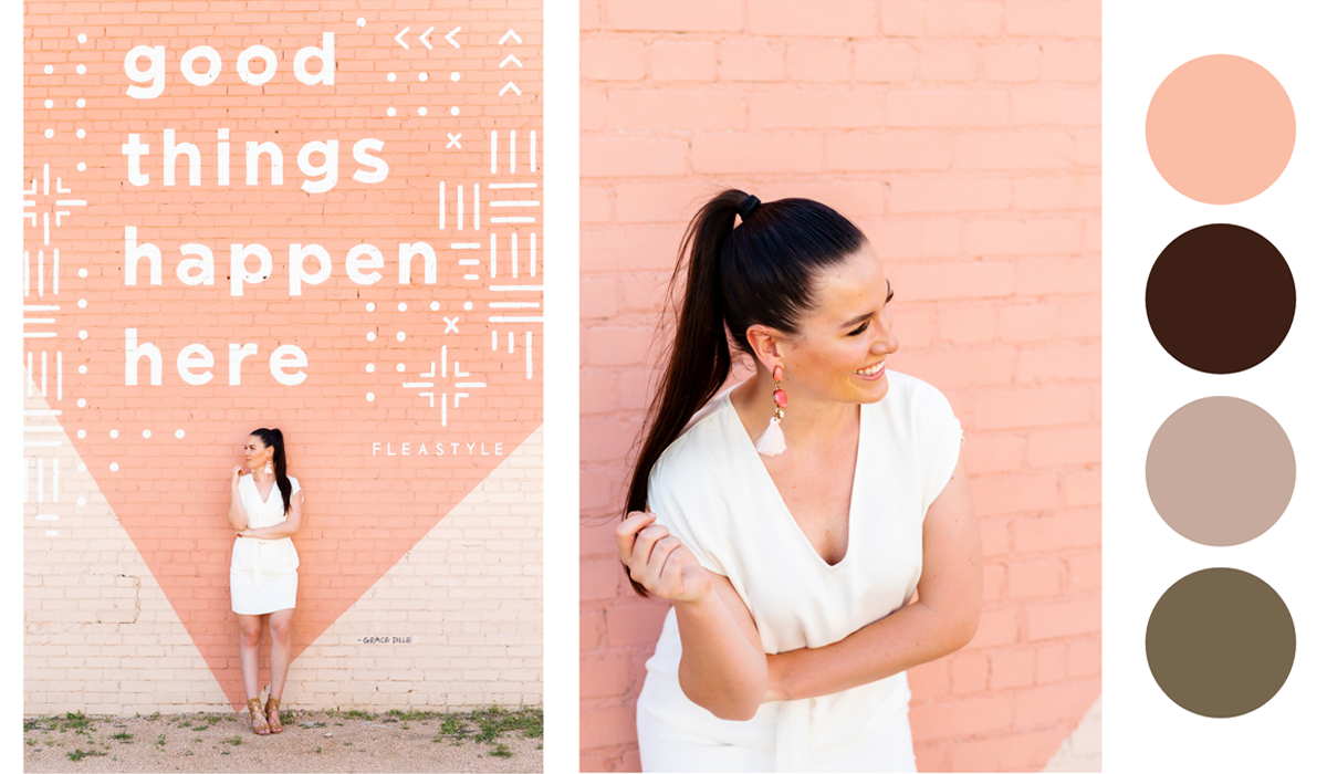
Palette #1
Why I like this palette:
I love this palette because it’s a great combination of warm and cool tones. All the colors of this particular palette are very earthy and give off welcoming, inviting energy while still being sleek and modern.
Statement color: Brown
With its red and orange undertones, brown makes the biggest statement in this palette for me. The brown featured here is a welcoming, warm tone that evokes a sense of strength and reliability. Brown is often associated with nature, friendliness, dependability, and safety.
Palette #2
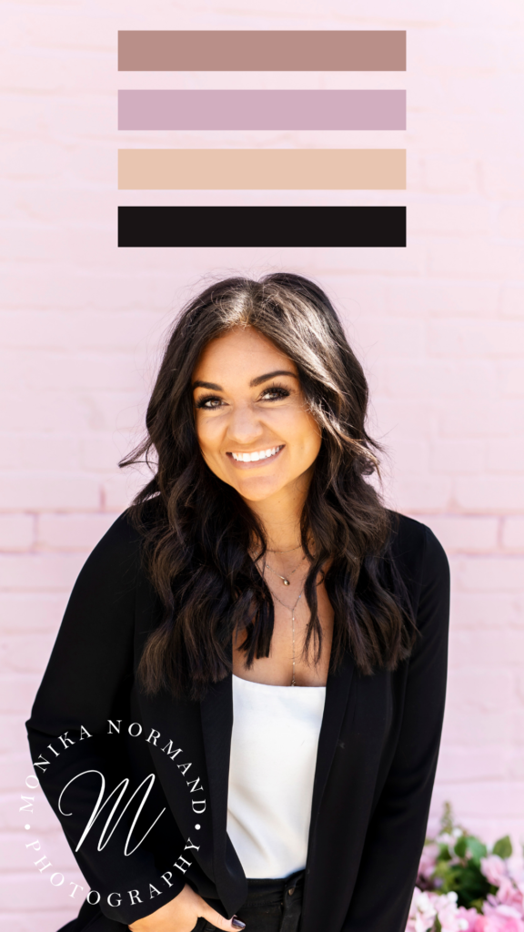
Why I like this palette:
I love this palette because it’s both feminine and bold at the same time. I like the soft, subdued hues of the pink tones you see here with a bold color like black to bring it all together.
Statement color: Lilac
I’m torn between lilac and black being the statement color in this palette. Black is a bold, strong choice, but I am going to go with lilac because it’s a rare, intriguing color to see. Light purple hues represent feminine energy and delicacy, as well as romantic and nostalgic feelings.
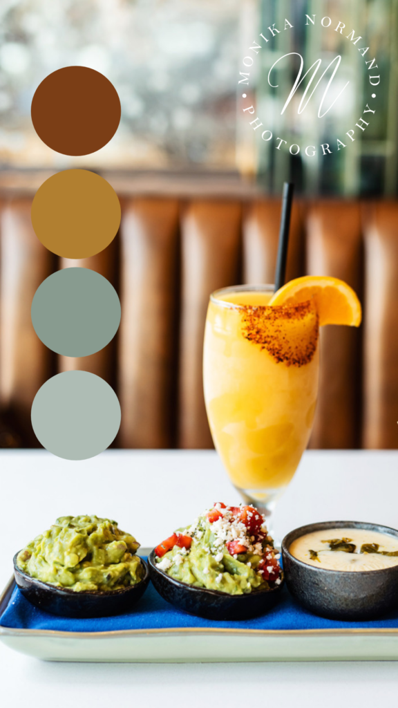
Palette #3
Why I like this palette:
Earthy, Tuscan tones are some of my personal favorites. I love olive green and how well it pairs with burnt orange. I also like the neutral light gray tones added to keep things cohesive and clean.
Statement color: Burnt Orange
Burnt orange evokes a feeling of warmth and comfort, and is often associated with Autumn. Orange in general is associated with joy, warmth, enthusiasm, creativity, encouragement, change, balance and health.
Palette #4
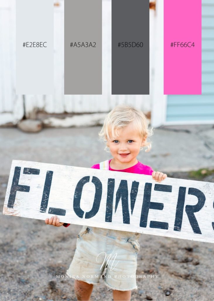
Why I like this palette:
This bold palette would be great for a brand that packs a punch. I like the cool gray tones paired with the vibrant fuchsia. It’s a sleek, classy take on a statement color like pink.
Statement color: Fuchsia
Fuchsia has a feminine vibe and also represents maturity and certainty. It is packed with energy and doesn’t go unnoticed.
Palette #5
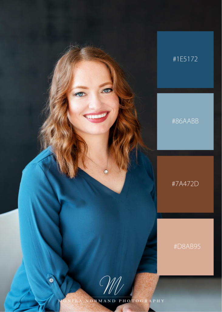
Why I like this palette:
I love the pairing of warm and cool tones – blues and browns are are a nice compliment to one another.
Statement color: Oriental Blue
Oriental blue is the color that stands out the most in this palette for me because it’s a tone of blue that I don’t see often. Blue tones convey a calm and serene feeling and are also associated with trust and strength. Blue is one of the most popular colors to use for interiors because of how soothing It can be.
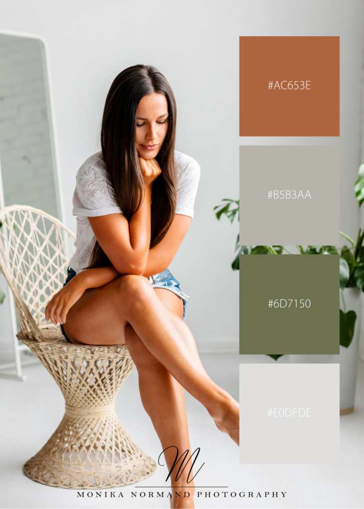
Palette #6
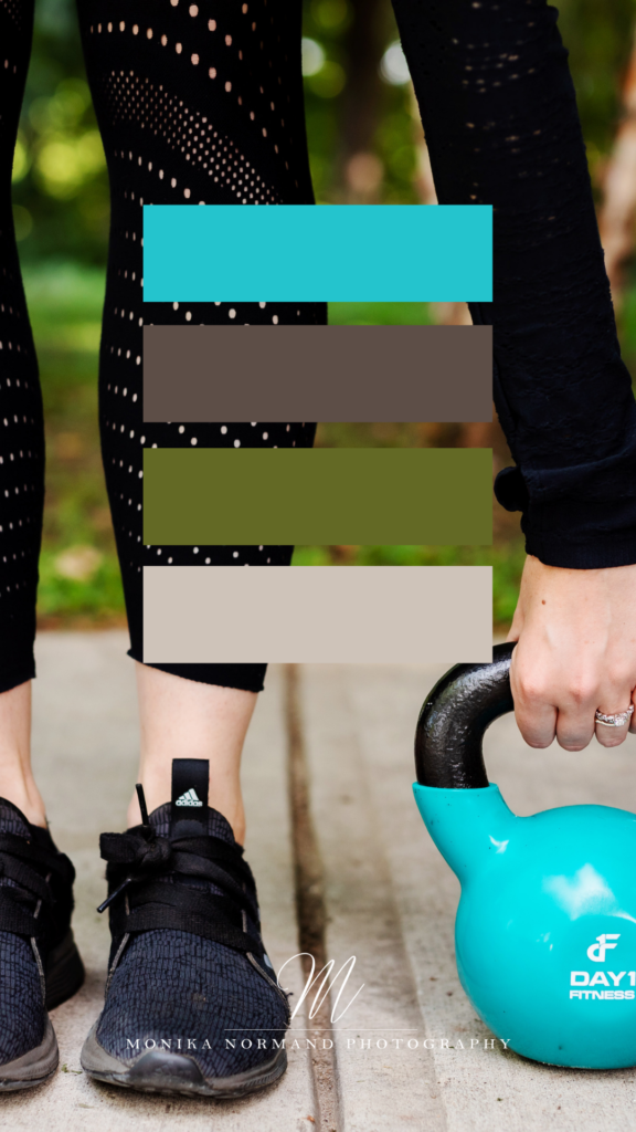
Why I like this palette:
I love this palette because it’s cool and earthy and feels refreshing. Turquoise is a great pop statement color here too.
Statement color: Turquoise
Turquoise is a beautiful statement color that combines the tranquility of blue, the growth of green, and the energy of yellow. Turquoise also alleviates feelings of stress, and provides hope of protection and good fortune.