

10 Branding Color Palettes for your Website and Brand Design
As a branding photographer here in Dallas, I’ve come to appreciate the crucial role that color plays in the world of branding.
When it comes to building a strong brand, color is much more than just an aesthetic choice. Your brand’s color palette is one of the ways you communicate with your audience without saying a word, and this is why it is so important to put together a good color palette for your brand. Your brand colors tell your audience how to feel about your brand and it influences their decisions about your brand. Colors evoke certain feelings, thoughts, and moods, and it’s important to choose colors that guide your audience to what you want them to think and feel about your brand.
As a branding photographer, it is my job to encourage my clients to play with intentional use of colors and identify what colors they want to infuse in their brand imagery. I’ve worked with a variety of clientele to help them identify the story and messaging they want to communicate to their audience and then figure out how to use their brand colors to support those messages. Whether it’s the calming effect of cool blues or the energetic vibe of warm reds, each color choice contributes to a brand’s unique personality, creating a visual language that resonates authentically audiences.
1. “November” – Brown, Blue and Green Color Palette
Brown is one of my favorite colors, and with its earthy and grounded tones, it communicates a reliable and down-to-earth appeal. Brands opting for a brown palette often project a warm, approachable image, making them perfect for those who have a brand that focuses on the artisanal and handmade. On the other hand, green, associated with nature and growth, signifies freshness, harmony, and renewal. Personal brands that communicate health, sustainability, or a connection with the outdoors find greens immensely effective. Wellness coaches, sustainable personal brands, or a brand that prioritizes organic products will love a brown and green color palette.
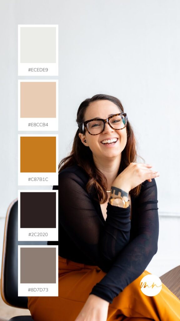
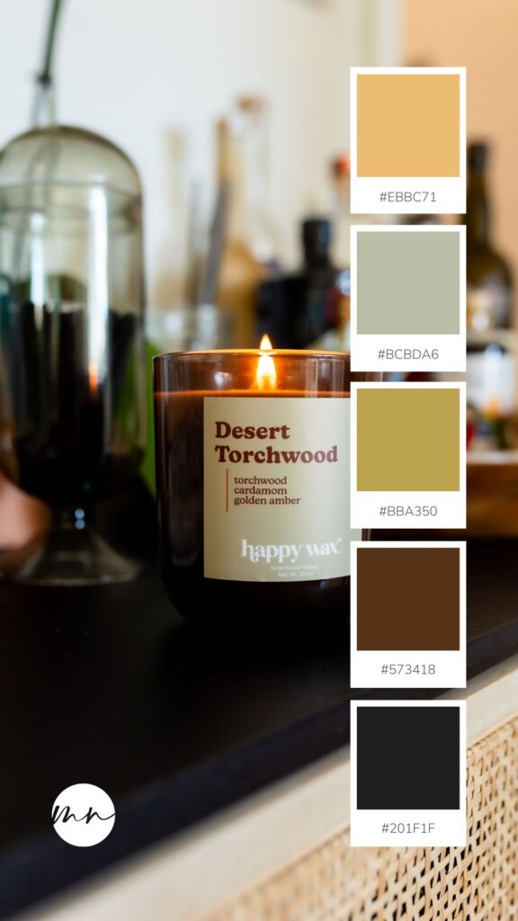
2. “Coffee” – Orange Tan and Brown Color Palette
Orange is a color that I use in my own brand, and it’s because it radiates vibrancy, energy, and creativity. Brands that include orange in their color palette usually exude a sense of enthusiasm, friendliness, and a bold approach. The vibrant energy of oranges complements the earthy and grounded tones of browns. When you use these two colors together, orange adds a dynamic pop of color, filling the palette with enthusiasm, while brown provides a sense of stability and adds to the warmth of the palette. This pairing is particularly effective for brands seeking a blend of playfulness and reliability. If you are a creative professional (like myself) or have a youthful and dynamic personality, this color palette will be perfect for you.
3. “Coastal Storm” Blue and Gray Color Palette
Blues and greys in a brand color palette convey a sense of calm, trustworthiness, and sophistication. Blue, is often associated trust, reliability, and serenity. It is usually chosen brands aiming to establish a sense of professionalism and stability. Greys, on the other hand, evoke feelings of balance, neutrality, and modernity, making them excellent for complementing the steadiness of blue tones. When you pair these two colors together, you create a harmonious and versatile palette that exudes a sense of professionalism and modernity. This combination is perfect for personal brands in industries such as finance, technology, or corporate consulting, where conveying trust, competence, and a contemporary outlook is important.
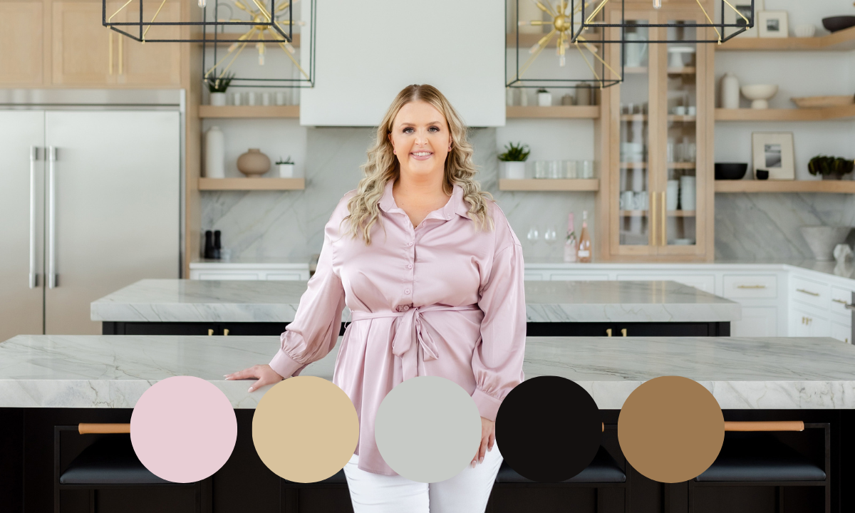
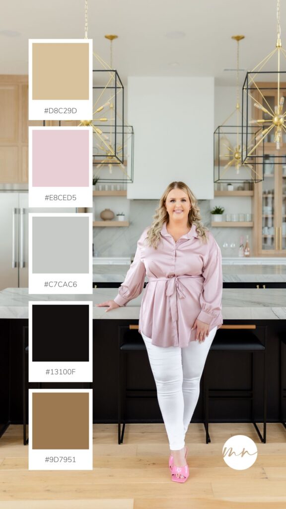
4. “Tamany” – Neutral Color Palette with a Pop of Pink
At first glance, it may feel like these two colors should be nowhere near each other, but these colors balance out each other quite well. Pinks and browns in a brand color palette create a delightful fusion of warmth, sophistication, and charm. Pink, with its sweetness, romance, and playfulness, brings a touch of vibrancy to the palette. When paired with the earthy, grounded tones of brown, it balances the playfulness with a sense of reliability and timeless elegance. This combination is well-suited for personal brands that seek to convey a harmonious blend of approachability and sophistication. It’s a perfect match for lifestyle influencers and boutique brands who want to exude a warm and inviting aura. Brands in the beauty and wellness industry can leverage this palette to communicate a sense of nurturing care, creating an aesthetic that is both visually appealing and emotionally resonant. The pink and brown duo offers a versatile and charming palette that captures attention while maintaining a sense of authenticity and elegance.
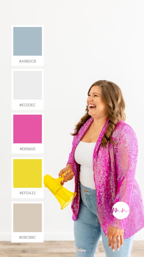
5. “Playful” Yellow Pink and Blue Color Palette
Yellows and pinks in a brand color palette are a dynamic duo that exudes positivity, energy, and a playful spirit. Yellow, symbolizes optimism and creativity, and pairs seamlessly with the vibrant and cheerful nature of pink. Together, they create a palette that radiates joy and exuberance. This combination is well-suited for personal brands that aim to project a lively and uplifting image, making it perfect for brands who is main goal is to lift their audience up and help them feel good about themselves. The synergy of yellow and pink communicates a sense of fun and approachability, making it particularly appealing to those targeting a youthful and dynamic audience.
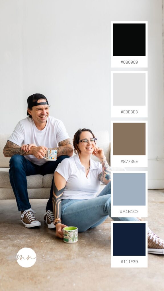
6. “Classic American” – Blue, Grey and Brown Color Palette
Sophistication and balance are what people will read when they see a combination of blue, grey and brown in a brand color palette. Blue, representing trust, professionalism, and serenity, is complemented by the neutral and modern tones of grey, evoking a sense of stability and neutrality. The addition of brown introduces warmth and grounding, creating a harmonious blend. Together, they form a palette that communicates reliability, professionalism, and timeless elegance. If you want your brand to communicate a inviting sense of calm, comfort and elegance, this is a color palette you should consider.
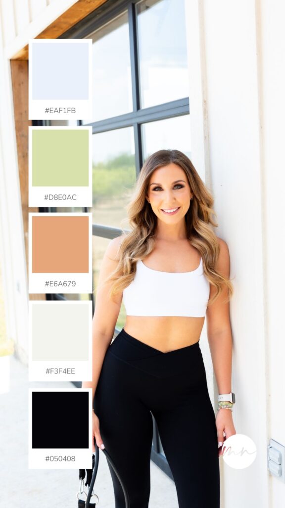
7. “Modern Scandinavian Spring” – Light Green and Blues
Light greens and light blues in a brand color palette communicate freshness, tranquility, and a sense of harmony. Light green embodies nature, growth, and a rejuvenating feel, while light blue conveys calmness, trust, and openness. When paired together, these colors create a serene and airy atmosphere that is both inviting and refreshing. This combination is best for personal brands associated with wellness, health, and lifestyle. Whether you’re a fitness coach or a holistic wellness influencer, the light greens and blues palette can evoke a sense of balance and natural vitality. It’s also fitting for brands in the hospitality or travel industry, as it conveys a peaceful and welcoming ambiance. The combination of light greens and blues is versatile, offering a visually appealing and emotionally resonant palette for brands seeking a fresh and optimistic brand identity.
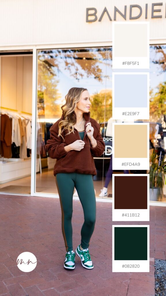
8. “Late October” – Warm Brown and Green Color Palette
Dark browns and greens in a brand color palette evoke a sense of earthiness and a feeling of being at home in nature. Dark brown signifies reliability, strength, and stability, while dark green embodies growth, harmony, and a connection to nature. When combined, these deep, rich tones create a palette that exudes a sense of grounded authenticity and natural balance. This pairing is particularly well-suited for personal brands focused on sustainability, outdoor activities, or organic lifestyles. For product brands, especially those in the realm of organic goods or home decor, the combination of dark browns and greens communicates a sense of trustworthiness, reliability, and a deep appreciation for the environment.
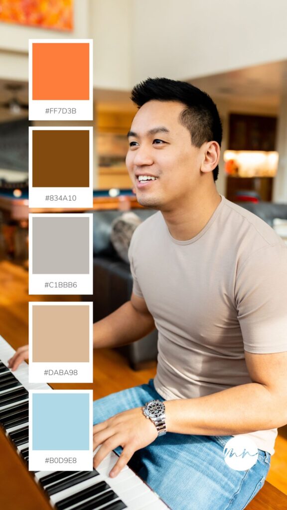
9. “The Traveler” – Blue and Orange Color Palette
Blues and oranges in a brand color palette create a dynamic and engaging combination that communicates trust, enthusiasm, and energy. Blue, symbolizes reliability and calm, and complements the vibrancy and playfulness of orange. They form a palette together that balances professionalism with a lively spirit. This combination is well-suited for personal brands seeking to convey a sense of approachable expertise, making it perfect for professionals, entrepreneurs and consultants. If you’re an entrepreneur motivated by innovation, this color palette gives you the chance to build a brand identity that is seen as vibrant and trustworthy.
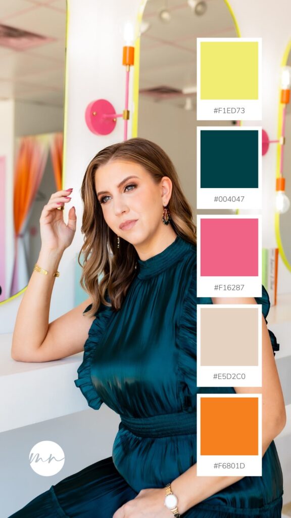
10. “Gogo Dancer” – Pink, Orange and Green Color Palette
Pink, green, and orange in a brand color palette are a lively and expressive trio that communicate a sense of warmth, freshness and creativity. Pink is associated with playfulness pairs harmoniously with the rejuvenating and calming qualities of green. The addition of orange infuses energy and enthusiasm, resulting in a vibrant and dynamic palette. This combination is best for personal brands that want to exude a sense of youthful exuberance and creativity. It’s perfect for lifestyle influencers, coaches, fashion brands, or those in the beauty and wellness industry who want to convey a fresh and spirited identity. The pink, green, and orange palette is versatile, offering a visually engaging and emotionally resonant choice for individuals who want to project a fun, modern, and approachable brand image.
The colors you choose for your brand matter. A strong brand is not complete without colors that accurately represent the values important to the brand and convey the desired emotions to the audience. As a branding photographer, guiding my clients through this process is my responsibility. If you’re ready to discuss how to infuse colors into your brand, feel free to send me an email at info@moniknormandphoto.com.